
The Brecon Beacons Collection: Ten New Michael Harding Oil Colours Arrive at Parkers
An artist's guide to handling, working with, and falling in love with a medium more than a century in the making.
As an oil painter, opening a new Michael Harding colour is always an experience. The paint has that unmistakable density and presence on the palette—the pigment feels substantial beneath the brush, the colour is concentrated, and even a small amount can transform a mixture. These are paints designed by someone who understands that artists do not simply need more colours; we need colours with individual character, dependable handling and a convincing reason to earn their place on the palette.
Michael Harding officially launches the Brecon Beacons Collection worldwide: ten new handmade oil colours completing the company’s remarkable 40-colour anniversary release. This is the fourth and final collection created to celebrate 40 years of Michael Harding Paint, following the Tunbridge Wells, Brick Lane and Whitechapel selections.
As an oil painter, opening a new Michael Harding colour is always an experience. The paint has that unmistakable density and presence on the palette, the pigment feels substantial beneath the brush, the colour is concentrated, and even a small amount can transform a mixture. These are paints designed by someone who understands that artists do not simply need more colours; we need colours with individual character, dependable handling and a convincing reason to earn their place on the palette.
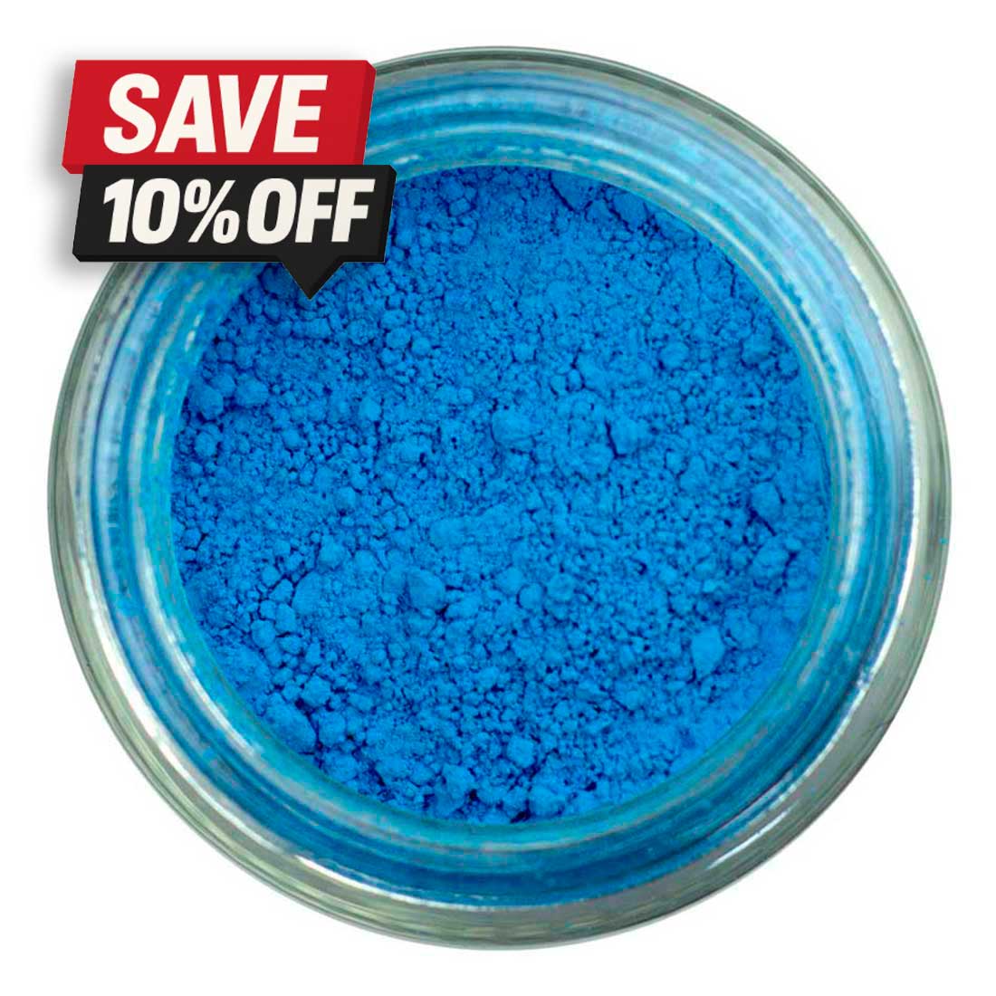
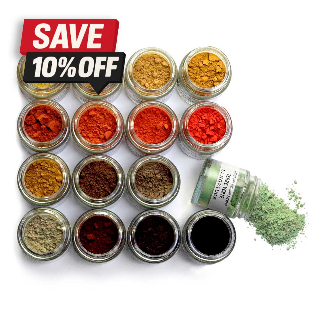
Raw Dry Ground Pigment conveniently available in 120ml jars from Langridge Colour. Only the most superior pigments are sourced from around the world.
A Legacy Worth Knowing
The Brecon Beacons Collection takes its inspiration from the landscape surrounding Michael Harding’s home and manufacturing base in South Wales. After relocating there around 2009, he became immersed in a place of vast skies, deep valleys, rapidly changing weather and sudden passages of illumination. Rather than attempting to reproduce one particular Welsh view, the collection evokes the emotional experience of landscape: distance, shadow, damp earth, brilliant light and colour emerging through atmosphere.
The resulting ten colours are Bismuth Vanadate, Hansa Yellow Medium, Amber, Pyrrole Crimson, Perrindo Maroon, Corinthian Purple, Imperial Purple, Cobalt Blue Deep, Cosmic Blue and Forest Green. All ten are vegan, non-toxic and rated as having excellent lightfastness.

1. Precise machinery and artisan handmade skills work in partnership. 2. Glueing the brush tip into the metal ferrule to secure it before adding the handle.
A Pair of Distinctive Yellows
Bismuth Vanadate is an opaque, high-tinting yellow with a soft but distinctly zesty brightness. It offers the freshness artists expect from a modern yellow while maintaining the covering power required for decisive passages of light. I can imagine using it in sunlit grasses, brilliant flowers, illuminated architecture and lively mixtures where a transparent yellow would lack sufficient body.
Hansa Yellow Medium, by contrast, is transparent, warm and powerful. It has a rich, almost yolk-like quality and should prove particularly useful for mixing luminous greens and glowing oranges. Because it is transparent and high in tinting strength, it can introduce warmth without immediately making a mixture chalky or opaque. For landscape, still life and floral painters, this may become one of the most versatile colours in the release.

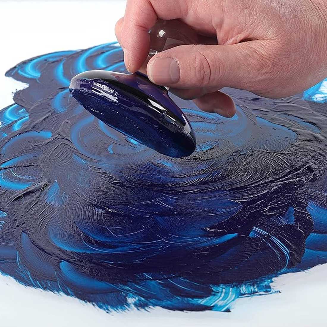
A professional glass muller and slab are used to combine the dry pigment and binder medium in their simplest form to create colour.
Warmth, Fire and Deep Red
Amber is perhaps the collection’s most immediately evocative colour. Sitting between deep orange and burnt gold, it has a warm, semi-transparent glow that suggests autumn foliage, late-afternoon light, richly coloured earth and luminous flesh tones. Its relatively high oil content should make it especially attractive for glazing and transparent passages. Against a deep blue, Amber appears to radiate warmth, exactly the kind of complementary interaction that can bring a painting to life.
Pyrrole Crimson is a transparent, blue-biased red with clarity and intensity. It provides access to those difficult cool reds required for dramatic sunsets, florals, deep accents and vivid violet mixtures. It should also mix beautifully with the two new blues and purples without introducing the muted brown undertone associated with some traditional crimson pigments.
Perrindo Maroon moves into darker, richer territory. It is a transparent, deep fiery red described as having the colour of redcurrant fruit. For artists familiar with Alizarin-type colours, Perrindo Maroon offers a permanent, lightfast alternative with its own distinctive warmth. I would expect it to be particularly valuable in deep floral shadows, transparent flesh mixtures, dark drapery and atmospheric landscape passages.

Purples for Atmosphere and Nocturnes
The collection contains two very different purples.
Imperial Purple combines Ultramarine and Quinacridone Violet pigments, producing a transparent colour with both depth and brilliance. It should move naturally between rich chromatic shadow and glowing violet passages, while remaining useful for neutralising yellows and warming cool blue mixtures.
Corinthian Purple combines three pigments to produce a semi-transparent purple filled with complexity. This is the colour that immediately makes me think of nocturnes, approaching storms, evening shadows and the last violet light across distant hills. Michael Harding himself describes it as a colour that begins suggesting paintings as soon as it reaches the palette. Set beside Hansa Yellow Medium, it creates a vivid complementary tension that could energise an entire composition.

Two Blues with Very Different Personalities
Cobalt Blue Deep is a semi-opaque, very fast-drying blue made with PB74. It offers the permanence and elegant handling traditionally associated with cobalt pigments, but with a deeper and more atmospheric character. For landscape painters, it promises great possibilities in distant hills, storm-filled skies, cool shadows and passages requiring depth without the overwhelming staining strength of a phthalocyanine blue.
Cosmic Blue is altogether more mysterious. Beneath its dark, almost black appearance lies a sapphire-like blue that gradually reveals itself as the paint is spread or mixed. Semi-transparent and gem-like, it should be particularly effective in deep water, nocturnal skies, dark foliage and chromatic blacks. It is not simply another blue, it is a colour designed for discovery, revealing different qualities according to thickness, surrounding colour and illumination.

The Unique Benefits of Making Your Own Paint

Creating paint by hand offers several compelling advantages:
1. Control over consistency: from stiff, buttery paint to fluid, enamel-like mixtures.
2. Pigment integrity: using pure pigment without fillers or extenders.
3. Customisation: adjusting oil content, texture and drying behaviour.
4. Enhanced colour experience: many artists report greater depth and vitality in handmade paint.
5. Connection to process: a deeper understanding of how materials behave on the surface.
6. Perhaps most importantly: it fosters a more intentional approach to painting. When you’ve made the paint yourself, every brushstroke carries a greater awareness of the material beneath it.
A Landscape Green with Natural Depth
Completing the collection is Forest Green, a rich, semi-transparent and high-tinting green. Made using brown earth and blue pigments, it has a natural, sappy quality that should integrate easily into landscape mixtures. It could be used directly for deep vegetation, then shifted warmer with Amber or Hansa Yellow Medium, cooled with Cobalt Blue Deep, or subdued with Perrindo Maroon and the new purples.
What makes this collection particularly exciting is not simply the individuality of the ten colours, but the relationships between them. Amber intensifies beside Cobalt Blue Deep. Hansa Yellow Medium becomes more brilliant beside Corinthian Purple. Perrindo Maroon and Forest Green can form deep chromatic neutrals, while Cosmic Blue introduces mystery into shadow without reducing everything to lifeless black.
That is where Michael Harding colours are at their best: not as decorative additions, but as serious working pigments capable of changing how we see and construct a painting.
The Brecon Beacons Collection marks the conclusion of Michael Harding’s 40-colour anniversary celebration, but for painters it represents a new beginning, ten carefully considered colours inviting experimentation, unexpected harmonies and fresh ways of capturing atmosphere and light.

Glass Mullers | Slabs | Tools
Langridge Dry Pigment
Langridge Pigment Sets
Mediums For Paint Making

Artist Raw Materials

Escoda
Escoda Brush Sets

Da Vinci

NEEF

Parkers
Omega

Old Holland
Tintoretto
Subscribe to our Newsletter
The latest news, events and stories delivered right to your inbox